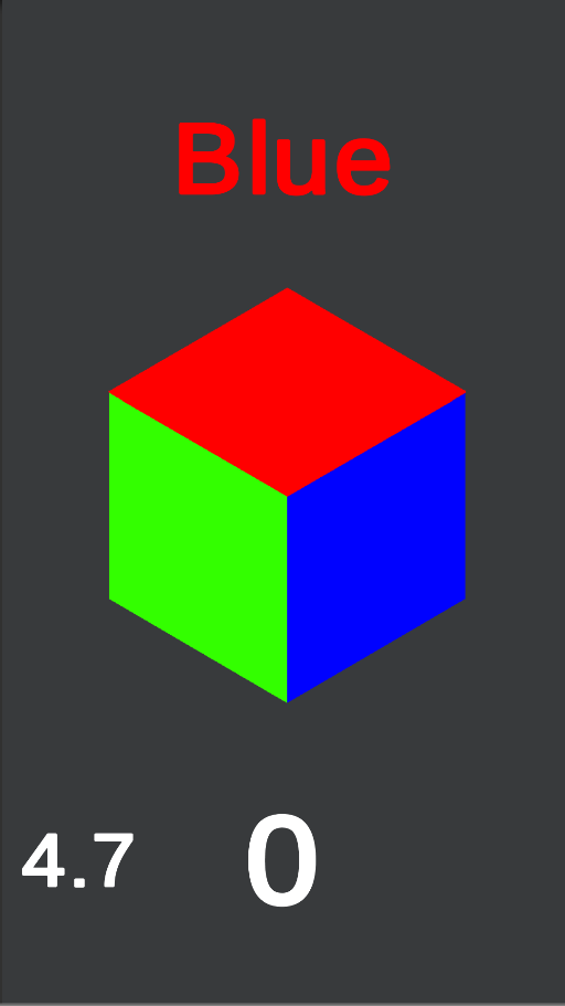
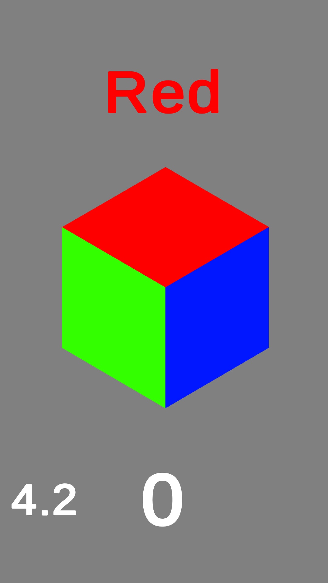
Color Craze is a mobile brain teaser solo project. The player is supposed to press the correct side of the cube, corresponding to the color that the text says. Both the text and the cube sides switch colors to confuse the player!
This was the first project I completed and looking back I can clearly see that. A lot could be improved, every color for every side is a gameobject. They switch by being set to disabled or enabled randomly has long as theres only one of each color.
If I were to remake this today I would have one gameobject for each side and switch the sprite colors and a int variable to match the color. That way it would be easier to check that theres always one of each color.
public void cubeclickleft()
{
    if(Leftgreen.active == true && Colortextgreen.active == true)
    {
        // Randomizes the cubes side color
        randomizecubevalue();
        // Randomizes the color that the text says
        randomizecolortextvalue();
        // Randomizes the color that the text is
        randomizetextcolor();
        // Does nothing (was meant to add the fastest click you've made to scoreboard but never implemented
        Averagetime();
        // Sets the timer to the standard value (depends on how much points you have)
        timer = standardtimer;
        // Plays a sound so that the player knows he/she pressed the right side
        Preloadermanager.instance.Dong.Play();
        // Adds a point to the score
        score++;
    }
    else if(Leftgreen.active == true && Colortextgreen.active == false)
    {
        // Adds the last score you had to check if its higher then any of your last 3 highscores
        Preloadermanager.instance.newhighscore = score;
        // Sets the score to show in the "you lost" scene
        Preloadermanager.instance.endscore = score;
        // Loads the "you lost" scene
        SceneManager.LoadScene(3);
    }
    if (Leftred.active == true && Colortextred.active == true)
    {
        randomizecubevalue();
        randomizecolortextvalue();
        randomizetextcolor();
        Averagetime();
        timer = standardtimer;
        Preloadermanager.instance.Dong.Play();
        score++;
    }
    else if (Leftred.active == true && Colortextred.active == false)
    {
        Preloadermanager.instance.newhighscore = score;
        Preloadermanager.instance.endscore = score;
        SceneManager.LoadScene(3);
    }
    if (Leftblue.active == true && Colortextblue.active == true)
    {
        randomizecubevalue();
        randomizecolortextvalue();
        randomizetextcolor();
        Averagetime();
        timer = standardtimer;
        Preloadermanager.instance.Dong.Play();
        score++;
    }
    else if (Leftblue.active == true && Colortextblue.active == false)
    {
        Preloadermanager.instance.newhighscore = score;
        Preloadermanager.instance.endscore = score;
        SceneManager.LoadScene(3);
    }
}
I feel that the UI is a weak part of this game. Since it was a solo project I tried to do a minimal art approach, simple shapes and colors. And while it worked for the actual gameplay parts, The menu is confusing to navigate.
Each menu is a panel with all the buttons being child objects. To switch menu it does the same has with the cube sides. It enables the menu the player want to go to and disables all the others.
//One of the menu switches
public void OpenPlayMenu()
{
    MainPanel.SetActive(false);
    HighscorePanel.SetActive(false);
    SettingsPanel.SetActive(false);
    InfoPanel.SetActive(false);
    GameSelectPanel.SetActive(true);
    HighscorePanelTT.SetActive(false);
    HighscorePanelRE.SetActive(false);
    HighscoreSelectPanel.SetActive(false);
}
//When a player press play normal game button
public void Playgame()
{
    SceneManager.LoadScene(2);
}
Not every menu would need to be disabled with every menu button press but it was made that way because I wanted to be 100% sure no menus overlapped. That resulted in so much unnecessary code and maked it harder to read.
This was also the first game I attempted to release on the Google Play Store. I aimed to learn about the release process and understand how to effectively incorporate feedback into future developments.
After joining an online community for feedback on the app, I decided to change the background color from dark gray to a lighter shade. This adjustment made the bright colors of the cube more visually appealing and easier on the eyes.
Old Color

New Color

I also adjusted the in-game timer to a lower maximum time, but it could still be optimized further, as it remained relatively slow.